
balance of your world
Education package to accompany the exhibition 'Balance of your World'
Before the Exhibition
Before you go to the exhibition you will need a knowledge of the elements of art, particularly colour and shape.
THE ELEMENTS OF DESIGN
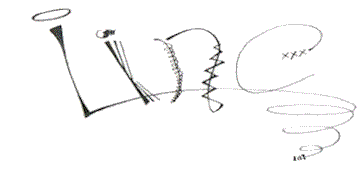
LINE
Line can be considered in two ways. The linear marks made with a pen or brush or the edge created when two shapes meet. Different lines express different emotions, such as swirled lines which create a gentle and peaceful mood.
SHAPE
A shape is an enclosed area of space. Shapes can be jagged, geometric, irregular or flowing.
TEXTURE
Texture is the surface quality of a shape - rough, smooth, soft, hard, glossy etc. Texture can be physical (tactile) or visual.
COLOUR
Colour or hue describes the visual light which we look at. In art, the primary colours are red, blue and yellow, whilst the secondary colours are orange, violet and green. Different tones exist within each of these colours.
TONE or VALUE
Tone is the lightness or darkness of a colour. It can create distance through bringing forward light parts and pushing back dark parts. It also creates emotion such as contrasting colours making an image bright and lively, whilst similar and softer tones give or evoke a gentle mood.
PRINCIPLES OF DESIGN
BALANCE
Balance describes how the elements of design are arranged within an image. Formal balance is symmetrical when elements are given equal weight on either side. Informal balance is asymmetrical and occurs when the placement of the elements is not equal.
CONTRAST
Contrast occurs when different elements which are not alike are placed together to stand out and create a point of emphasis. It creates variety and creates a lively image.
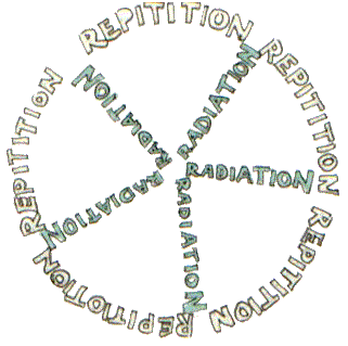
PATTERN or RHYTHM
Pattern or rhythm is created when elements are repeated to create movement.


(Canley Vale, 2012)